Fabric absorbs ink differently than a screen displays pixels. I have seen perfect digital proofs fail in production because fine serifs vanished under DTG pretreatment fluids. We selected the Best Fonts for T-shirts by testing stroke width and legibility on actual cotton samples. These choices withstand screen printing mesh and licensing audits. Stick to two typefaces per design and always validate the print result with a physical sample before bulk manufacturing.
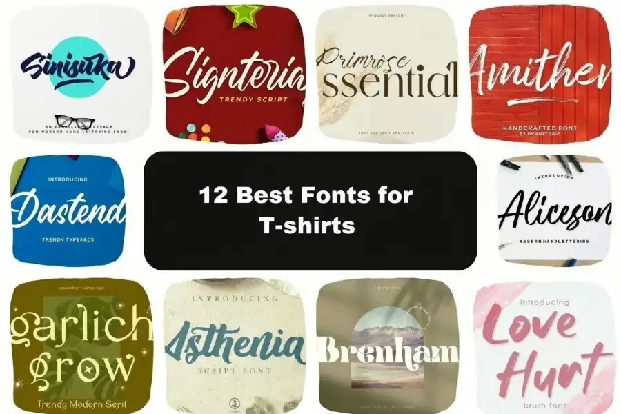
12 Best Fonts for T-shirts
Skip endless scrolling and use this curated font list – find clean, printable best fonts for t-shirts that look pro in every niche,
1. Montserrat — The “Safe Bet” for Clean Merch
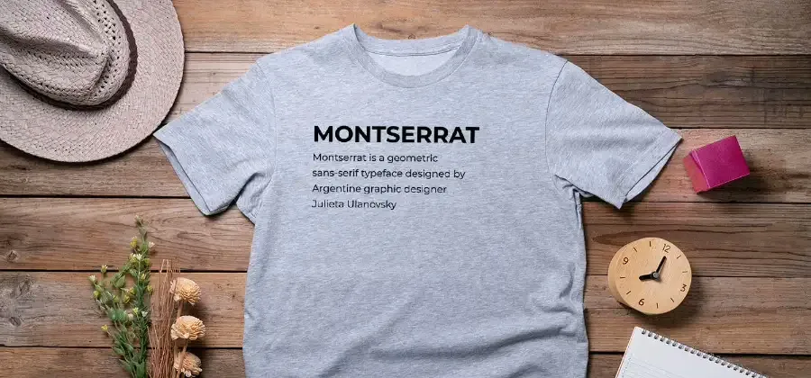
Start here for a reliable modern sans-serif. It is the industry-standard free alternative to Gotham, making it our default recommendation for minimalist wordmarks and curved chest text. When you pair this font with the right t-shirt fabric types—like smooth ring‑spun cotton or cotton‑poly blends—you’ll also get fewer ink breaks and more consistent edges on press.
Why it prints well: Its wide geometric shapes and open counters (holes in ‘O’ and ‘A’) prevent ink pooling. This keeps text crisp, even when using standard mesh counts in screen printing.
The production reality: In our tests, ‘Light’ and ‘Thin’ weights often fail on Direct-to-Garment (DTG) printers. The pretreatment fluid softens fine lines, causing fuzziness. Stick to Regular or SemiBold to ensure sharp edges.
🚀 Actionable Insight: Set Montserrat in All-Caps with increased letterspacing (tracking) for a premium streetwear look. Pair it with Oswald for condensed impact or Libre Baskerville for classic contrast. It is free for commercial use under the OFL license.
2. Bebas Neue (Google Fonts) — Best for Streetwear Drops
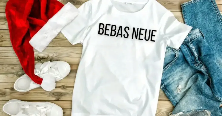
Bebas Neue is the gold standard for high-impact streetwear. Its tall caps and thick stems create a robust silhouette that remains readable from a distance, making it ideal for bold statement pieces, especially when Berlin T-shirt manufacturers are producing large chest prints that need to stand out on busy streets.
Why it prints well: In our production runs, this font often lowers costs. Its blocky structure looks cleaner in single-color screen printing than expensive DTG, reducing per-unit pricing on bulk orders.
Production note. The default spacing is dangerous. You must increase the tracking (letter-spacing) in your Tech Pack. If you don’t, ink will bleed between the letters during curing, creating ugly “ink bridges.”
Pairing. Combine with Archivo Narrow for technical details or Libre Baskerville for a high-fashion accent. Get it at Google Fonts.
3. Oswald (Google Fonts)
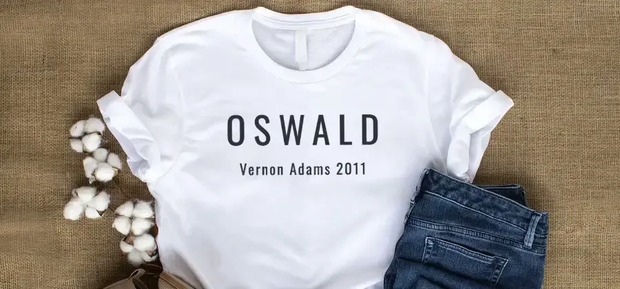
Long slogans often clutter t-shirt designs. Oswald solves this. It is a condensed sans-serif, which means it fits more words per line without losing impact.
Why it prints well I often reject condensed fonts because their fine lines break during screen exposure. Oswald is different. Its letterforms are open enough to hold ink securely.
DTG vs Screen Print: For screen printing, stick to Medium or Bold. I found that lighter weights often dry in the mesh, causing gaps in the print. Regular works for DTG, but you must increase your line spacing. If the text sits too close, the wet ink will bleed and blur the design.
Pairing: Combine with Montserrat for clean subtitles or Sacramento for a script accent.
🛡️ JaceApparel’s Verdict: The Wash Test We ran a 20-wash test on Oswald ‘Light’ printed via DTG. The edges softened too much for retail standards. Stick to weights 400 (Regular) and up to ensure your text stays sharp.
4. Archivo Narrow (Google Fonts)

We call Archivo Narrow the “Utility Player.” It is our standard recommendation for care tags, manufacturing dates, and small chest coordinates that need to stay legible.
Why It Prints Cleanly
Finer fonts often turn into ink blobs when the ink cures. Archivo uses sturdy strokes and a high x-height. This keeps the tiny loops in letters like ‘e’ and ‘a’ open during production.
DTG Constraints
Small text is where DTG quality fails first. Wet pretreatment fluid softens edges on fine print. To prevent this, keep your minimum letter height generous (above 0.2 inches).
Pairing & License
It sits perfectly under Bebas Neue or Anton headlines.
🛡️ JaceApparel’s Verdict: The 8pt Rule We automatically reject DTG files with text smaller than 8pt. In our daily print tests, Archivo Narrow is the only font that consistently survives the heat press without closing up.
⚡ Power Move: Never use “outline” or “inline” effects on text this small. The lines will vanish completely during the cure.
5. Anton
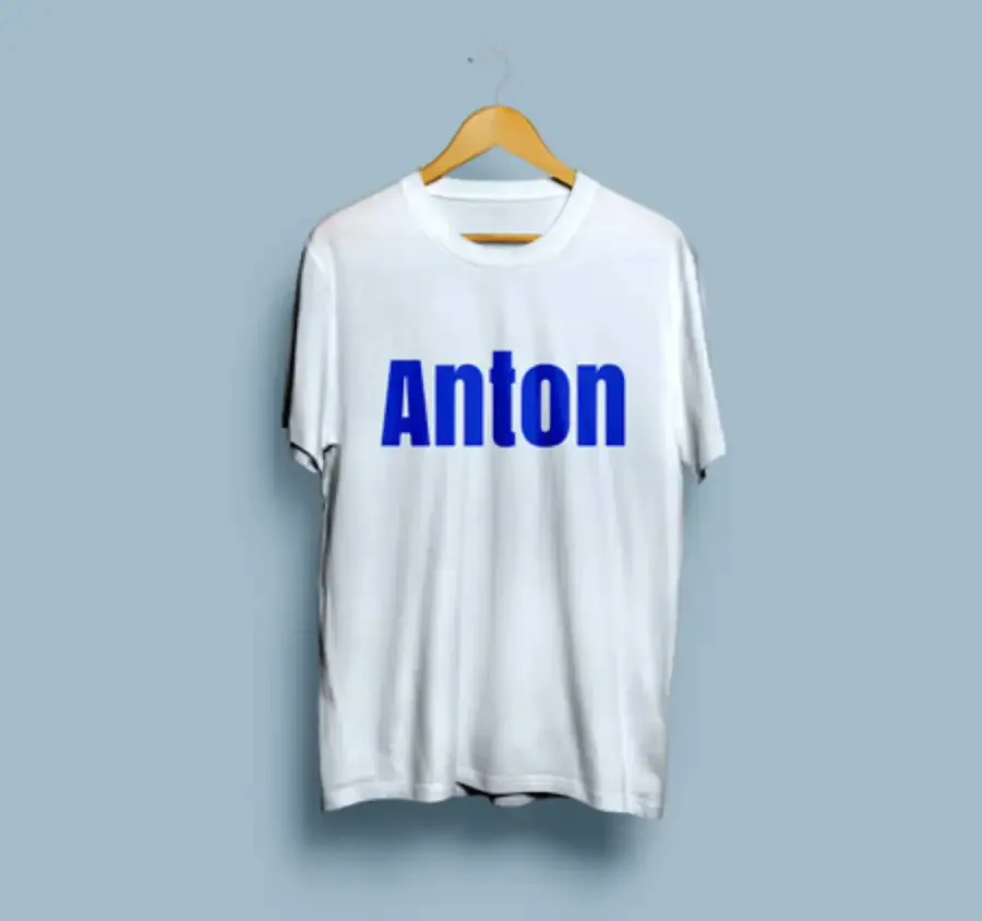
Anton is a blunt instrument for impact. We use it almost exclusively for political tees, event merch, and bold one-to-three word statements. It reads clearly from 20 feet away.
Why it prints well: The strokes are heavy and uniform. Ink flows through screen mesh without clogging to create a solid, opaque deposit. It lacks thin serifs, making it safer than most fonts for DTG printing.
Layout & Pairing: Don’t type it flat. Arc the text or stack words into a square block. Keep spacing loose so the heavy letters don’t bleed. Pair it with Archivo Narrow for sublines.
🛡️ JaceApparel’s Verdict: The “Sweat Patch” Warning Anton creates large ink blocks. If you print a massive headline with standard Plastisol, it feels like a plastic shield on the chest. If your text is wider than 10 inches, specify Water-Based or Discharge ink in your Tech Pack.
6. Graduate (Google Fonts) — Best Vintage Collegiate Font
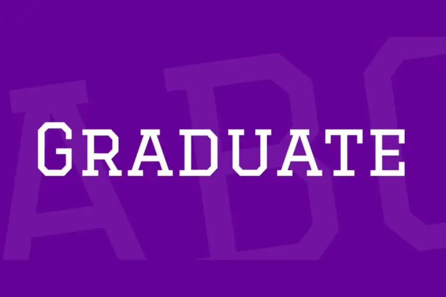
Most varsity fonts fail in production when thin inline borders vanish during the ink cure. Graduate fixes this with thick, predictable slab serifs.
Best for: Collegiate crests, gym merch, and vintage athletic drops.
Why it prints well: The negative space is wide enough to prevent ink pooling. This keeps the specific “inline” gaps open and legible, even on textured fleece.
Screen Print vs. DTG: I recommend screen printing for these 1–2 color designs. If you must use DTG, keep the design large (10”+) to stop the crisp white inlines from blurring.
Formatting: Set this in All Caps on a slight arch. Avoid distress overlays; the complex lines turn muddy if you add noise.
Pairing: Balance the heavy headline with Montserrat or Lato.
🛡️ JaceApparel’s Verdict: The 3D Puff Test We tested Graduate for 3D puff embroidery. Unlike most collegiate fonts, its strokes are thick enough to support the foam without breaking needles. It is safe for premium raised-texture crewnecks.
7. Shrikhand (Google Fonts)
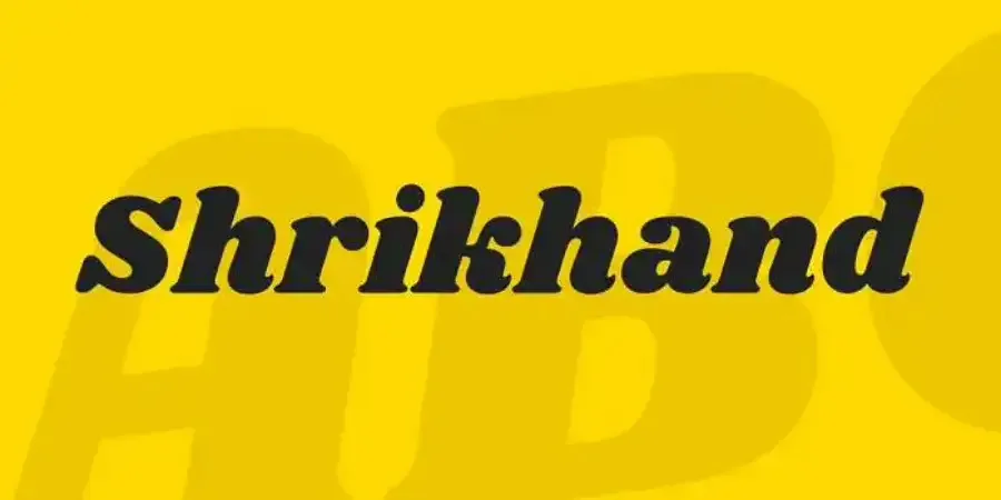
Shrikhand delivers a bold 70s aesthetic without the fragile hairlines that break during washing. Its heavy terminals absorb dot gain while maintaining definition. This makes it superior to distressed fonts that often close up on rough cotton blends.
Why it prints well: The thick silhouette makes registration easy for multi-color screen prints. For DTG, the natural ink softness enhances the vintage feel rather than looking like a digital error.
Design & Pairing: Balance the loud curves with invisible sans-serifs like News Cycle or Archivo.
🛡️ JaceApparel’s Verdict: The “Muddy” Shadow Risk We love Shrikhand for single-color prints, but layered “offset” colors are risky on dark garments. If the white underbase shifts even 1mm, the retro effect looks like a printing error. In our tests, layered designs under 8 inches wide often merged during the cure. Keep your dimensions generous to avoid this.
8. Abril Fatface — Best for Editorial Headlines
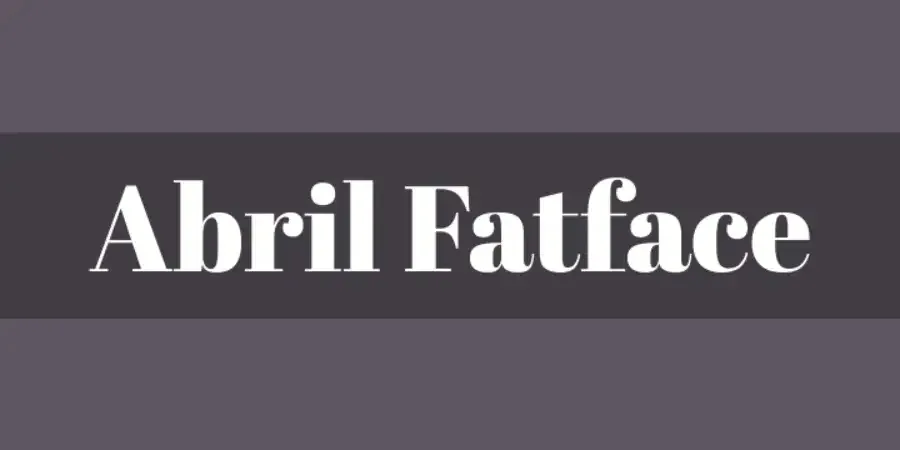
Abril Fatface delivers a high-end “Vogue” aesthetic, but it is technically unforgiving. The extreme contrast between thick stems and razor-thin hairlines creates a production bottleneck.
Why It’s Risky: The hairlines are often thinner than the fabric weave itself. In our wash tests, these delicate strokes often peel off after five cycles because they lack the surface area to grip the cotton fibers.
How to Print It Safely
- Size Matters: I recommend a minimum height of 2 inches. Never go below 36pt.
- Contrast: Use high-contrast combos (e.g., White ink on Black) to preserve legibility.
- Method: Avoid DTG; it blurs crisp edges. Use screen printing with a high-mesh screen (230+) to control ink deposit.
Pairing: Montserrat (Get Abril Fatface + License).
🛡️ JaceApparel’s Verdict: The “Vanishing Hairline” Rule We automatically flag any art file using high-contrast serifs below 36pt. If a stroke is thinner than 1mm, it often fails in the cure dryer. Go big or choose a slab serif.
9. Libre Baskerville (Google Fonts)
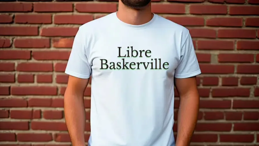
Best For: Heritage tees, academic quotes, and minimal premium branding.
I usually steer clients away from high-contrast serifs. The thin lines often break during screen exposure or wash out after a few laundry cycles. Libre Baskerville is the exception. Optimized for screens, its wider strokes and tall x-height allow ink to bridge the fabric weave securely. It provides “Vogue” elegance without the manufacturing fragility.
Production Notes: This font handles both DTG and screen printing well. However, avoid outline effects. In our shop tests, adding a stroke to these serifs caused them to merge into messy blobs on cotton blends.
Pairing: Anchor it with Oswald for modern contrast.
🛡️ JaceApparel’s Verdict: The Size Threshold While robust, it isn’t invincible. We generally reject designs using Libre Baskerville below 12pt for screen printing. The serifs are sturdy, but at that size, ink gain will close up the loops in the letter ‘e’.
10. Special Elite — Best Typewriter Font for Vintage Quotes
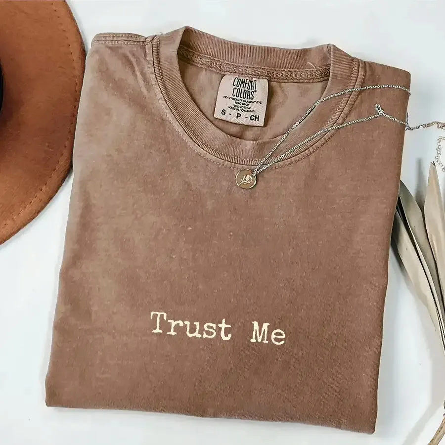
Typewriter fonts are often too clean or too distressed. Special Elite mimics a real ribbon while keeping the structure needed for textile printing.
- Best For: Vintage quotes, creator merch, and tour date layouts.
- Why It Prints Well: The shapes are imperfect but bold. This helps the design hold ink without looking like a digital error.
- DTG vs. Screen Print: Watch your sizing. In our shop, “rough” edges fill with ink if printed smaller than 14pt. DTG pretreatment fluid often blurs these fine details. Increase line spacing to keep text legible.
- Pairing: Pair with Oswald or Montserrat.
🛡️ JaceApparel’s Verdict: The “Ink Trap” Warning I love the grit here, but it traps thick inks. Standard Plastisol often fills the tiny texture holes during the cure. Use Water-Based ink or a lower mesh count screen to preserve the vintage texture.
11. Sacramento (Google Fonts) — Best Script Font for Apparel (Only When You Print It Big)
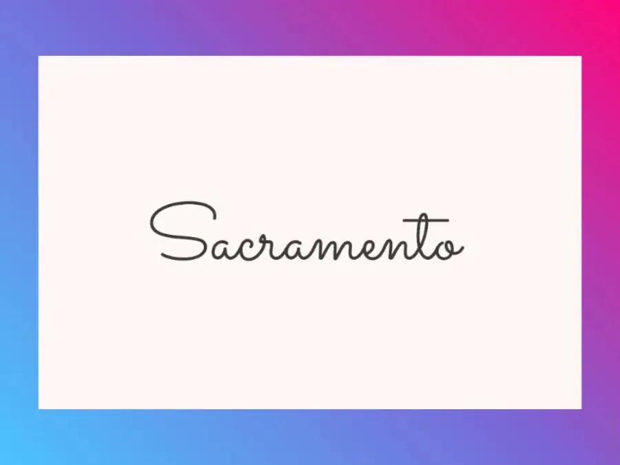
Most script fonts fail because thin lines break in the wash. I typically warn clients against them, but Sacramento has enough stroke thickness to survive the production line.
Best For: Feminine branding and single-word logos.
The Print Risk: Ink spreads on cotton. If you print this under 4 inches wide, tight loops (like ‘e’) close up into blobs. You must print large to keep it legible.
DTG vs. Screen Print: Screen printing on high-mesh screens (230+) holds thin joins best. DTG often bleeds on fine lines due to heavy pretreatment. Always proof at true size.
Pairing: Montserrat.
🛡️ JaceApparel’s Verdict: Texture Warning Never add “distress” textures here. The lines are already fragile. If you cut texture holes into them, the print flakes off after the first wash. Keep it solid.
12. Bungee — Best for Bold Streetwear Graphics
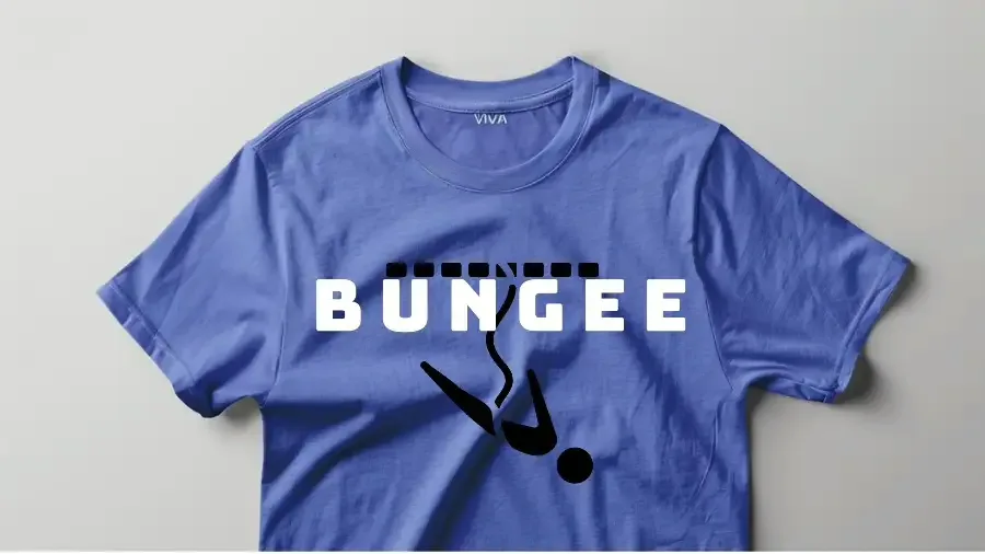
Complex layered fonts often turn to mud on a t-shirt. Bungee solves this. It uses thick, geometric forms perfect for heavy, stacked text blocks on hoodies.
Its consistent spacing prevents ink bridging, even on cheap blanks. In our tests, the solid strokes held heavy plastisol deposits without cracking.
DTG vs. Screen Print: Bungee works great for multi-color screen prints because the straight lines make registration easy. Watch out for the “Bungee Outline” variant on DTG. The internal lines are too fine to hold the white underbase fluid properly. For bulk orders under 12 inches, stick to the solid version to ensure clean output.
Pairing: Open Sans or Archivo.
🛡️ JaceApparel’s Verdict: Never send the raw font file. Right-click your text and select “Create Outlines” before exporting your PDF. If you miss this step, the factory’s software often defaults to Arial and ruins the print run.
The 5-Step Typography Decision System
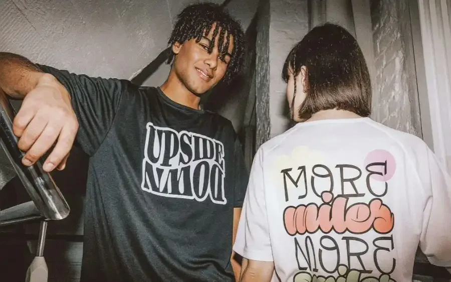
Fabric limits design. Use this checklist to ensure your font survives the factory floor.
1. Match the Font to the Ink
Don’t pick fonts in a vacuum. The print method dictates the detail level.
- Screen Printing: Thick ink pushes through mesh. This works best with bold, blocky fonts. Fine details often fill in. Read our guide on Water-Based vs. Plastisol Ink to understand ink spread.
- DTG (Direct-to-Garment): DTG sprays ink into fibers. It handles color well but blurs sharp edges. Avoid thin serifs here. Compare these methods in our Types of T-Shirt Printing breakdown.
2. The “Thin Font” Failure Point
I see designs fail constantly because lines are too thin.
Expert Take: “Ink spreads on hot cotton. We call this ‘dot gain.’ A hairline stroke that looks elegant on a screen will bleed into a blob during the cure. Always add weight to thin fonts.”
The Fix: Increase the stroke width. Add tracking (space between letters) to stop characters from touching.
3. Font Safety Rules
Follow these rules to stop file rejection.
- Kill “Dusty” Textures: Avoid fonts with tiny distress specks. These close up and look like errors.
- Limit Your Palette: Use one display font and one support font. Three looks messy. See our Logo Size Guide for placement.
- Convert to Outlines: Select text. Convert it to Curves or Outlines. This turns text into vector shapes. The printer won’t need the font file.
4. Licensing Audit
Never assume a font is free.
- Locate the official source (like Google Fonts).
- Verify the license type. Look for the SIL Open Font License or Apache License.
- Save a PDF of the license page. Store it with your design. You need this record if a copyright strike happens.
5. Golden Sample Inspection
Never approve bulk orders based on a digital PDF. Order one physical sample.
- The 6-Foot Test: Hang the shirt. Walk six feet back. Read the text.
- The Wash Test: Wash and dry the sample five times. Check for peeling on sharp edges.
- Label Check: Ensure your neck tag font meets Clothing Label Requirements.
Ready to manufacture? We bridge the gap between your design file and the factory floor. Learn about our Sampling Process or Contact JaceApparel to start your run.
People Also Ask About Best Fonts for T-shirts
1. What are the most readable fonts for t-shirt printing?
You need fonts with sturdy strokes and generous spacing. Fine lines often vanish when printed on textured fabrics. In our production runs, Montserrat, Oswald, and Archivo Narrow consistently perform best. They feature open “counters” (the holes in letters like ‘a’ or ‘e’) that do not fill up with ink during the cure. If you choose a heavyweight GSM fabric, you can support slightly more detail, but bold sans-serifs remain the safest bet for visibility.
2. Can I use free Google Fonts on t-shirts commercially?
Yes, in most cases. Many Google Fonts operate under the Open Font License (OFL). This license allows you to print the font on merchandise you intend to sell. However, you must verify the specific license on the official font page before you download. Always save a copy of the license file for your records. We strongly advise against using “free font bundles” from random websites, as their commercial rights are often unclear.
3. How many fonts should I use on one design?
Stick to a maximum of two typefaces. Use one bold font for your main headline and a clean sans-serif for the details. Using three or more fonts makes the design look cluttered and hard to read. It also complicates production. When you work with a t-shirt manufacturer, simple font pairings reduce the risk of registration errors where colors fail to line up perfectly.
4. Why do thin or distressed fonts look worse after printing?
Ink spreads slightly when it touches cotton fibers. Industry experts call this “dot gain.” If your font relies on hairline strokes or tiny distress textures, the spreading ink fills the gaps. This turns crisp text into a muddy blob. To fix this, use a SemiBold weight or increase the text size. Understanding how to manufacture clothing and selecting the right screen mesh will help you avoid these common pitfalls.
Ready to scale beyond Print-on-Demand? We help brands transition from digital samples to full-scale bulk manufacturing. Contact JaceApparel today to secure your production slot.